

The Pastel Goth Aesthetic: What It Reveals About the Person Who Lives In It
What Pastel Goth Actually Is
Pastel Goth is frequently misread as a softened version of gothic — as if someone took the darkness and turned down the contrast. This reading is wrong. Pastel Goth is not a mitigation of gothic aesthetics. It is a specific and deliberate juxtaposition: the same symbols, the same references, the same weight — held in tension with softness, with lightness, with colors that refuse to be bleak.
The person who lives in a Pastel Goth space understands something that people outside the aesthetic often don't: that the contrast is the point. The dark skull on the pale lavender wall is not an accident of decorating. It is the entire argument.
Softness as a Considered Position
People who choose Pastel Goth are not choosing it because they want gothic but find full gothic too intense. They are choosing it because they understand that softness, in the right context, is its own kind of severity. A pale pink room with a skull candle set on the nightstand is making a more considered statement than a simply dark room. It is asking two things of the viewer at once: read the softness, and read the darkness, and understand that the person who arranged this chose both intentionally.
This requires confidence. It requires someone who is not trying to communicate a single, legible aesthetic signal. The Pastel Goth person is comfortable with complexity, with the room holding more than one register simultaneously. They are not explaining themselves through their space. They are expressing something that cannot be easily summarized.
The Interior as Self-Portrait
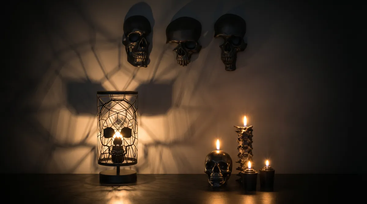
Pastel Goth interiors tend to be carefully arranged. Nothing is accidental. The pale bedding is not there because it was the easiest option — it is there because the person knows exactly how the dark skull lamp will look against it. The lavender wall was not painted by default — it was chosen for the specific way it holds the shadow of a mounted skull piece.
This level of intentionality is a defining characteristic of the Pastel Goth personality. These are people who think carefully about visual composition. They have a strong point of view about how things should look and a clear sense of when something is right versus when it is almost right. They notice the difference, and they care about it.
Pastel Goth is not gothic with an apology. It is gothic with a specific, considered argument about how darkness and light can coexist.
The Role of the Gothic Symbol
In a Pastel Goth space, the gothic symbol — the skull, the dark form, the heavy dimensional object — does not blend into its surroundings. It stands out. And this is the entire function of the symbol in this aesthetic: to remain legible as dark, as heavy, as gothic, even when everything around it is soft.
A skull candle set on a pale marble surface does not disappear. It asserts itself. A skull lamp in a room with blush upholstery and cream curtains is visible — its form, its base, its warm-dark presence. The skull wall decor on a sage green wall is the center of the composition precisely because it does not match.
This is not a failure of the aesthetic. It is the aesthetic. The gothic element in a Pastel Goth room is supposed to be the thing that does not quite fit — the thing that makes you look again, that makes the softness legible by contrast.
What This Person Looks for in an Object
Someone building a Pastel Goth space is not looking for gothic pieces that have been softened to match their palette. They are looking for gothic pieces that are genuinely gothic — dark, serious, uncompromising in their form — and bringing them into a soft context on their own terms.
This is a crucial distinction. An object that tries to be pastel-goth-appropriate by adding blush tones or rounding its edges is an object that misunderstands the aesthetic. The Pastel Goth person does not want the dark thing to meet them halfway. They want the dark thing to remain exactly what it is, and they will take responsibility for placing it correctly in the soft environment they have created.
This is why the absence of compromise in MAVRA's product design is a feature rather than a limitation in this context. The pieces are not trying to be decorative in a generic sense. They are dark, specific, and made to hold their own. In a Pastel Goth room, that is exactly what they do.
Living Inside the Contrast
The Pastel Goth person does not live in their space tentatively. They are not trying out the aesthetic to see if it feels right. They have made a decision about what their space should feel like, and they have built it with enough intentionality that the feeling is consistent.
Walking into a well-built Pastel Goth room, the first impression is soft — the palette, the textiles, the light. The second impression is the contrast — the skull piece that registers against the pale wall, the dark lamp on the light surface. The third impression, which is the one that stays, is the sense that these two things were chosen together, and that the person who chose them knew exactly what they were doing.
That is the Pastel Goth interior. It is not an accident. It is a self-portrait of someone who understands that beauty and darkness are not opposites, and who has arranged their home to prove it.


Mail
Facebook
LinkedIn
X
Pinterest